Thursday, 19 March 2015
Wednesday, 18 March 2015
Video Editing Journal - 2: Warp Stabilizer and Luma Keyed
I have implemented the Luma Key tool in a number of the introductory shots which should help set the tone better to a significant degree.
 |
| Luma Key Tool in place gives a sinister dim tone to the piece which is more of what I wanted |
In addition to this I have implemented the Warp Stabilizer tool to a fair portion of my Footage which I believe helps to smooth out the shots and make it look more legitimate. I have put together this short demonstration.
Spine for the CD
Given that CD's Include a Spine of sorts to make them easy to find, it is therefore a requirement in my CD that I create one that is easily linked to the front cover. So here is what I have come up with.
 |
| Incorporated designs from the CD Cover |
As you can see the Spine is very reminiscent of the CD cover which I have already produced, the intention of which is that it give the viewer a familiarity to the CD. The Logo of the rose is present at what will the be top of the CD if it is placed in a row with other CD's on its side, the idea is that the bright red logo on contrast with the black will make it stand out, from there the viewers eyes drift downward to see the band title and name of the album. In keeping it professional the product and licensing code of the CD is present at the end or bottom of the CD as it is in most cases.
As you can see the similarities between the Spine and the front cover make it easily identifiable in a CD rack.
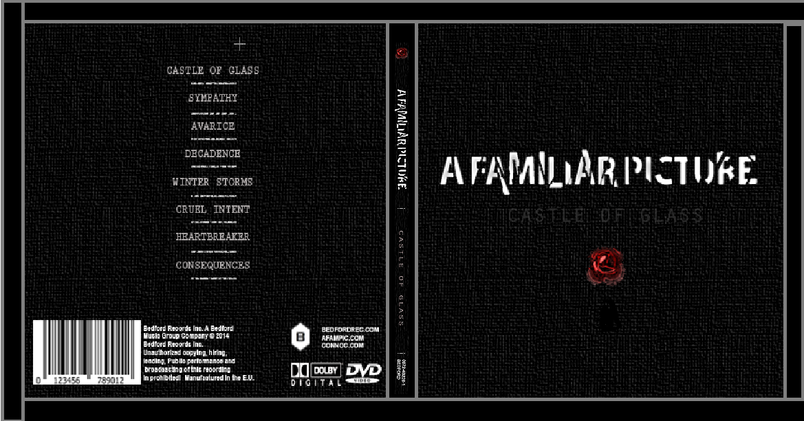 |
| Incorporated to the CD |
As you can see the similarities between the Spine and the front cover make it easily identifiable in a CD rack.
Monday, 16 March 2015
Album Booklet Pages
These are the pages to the booklet that I have been working on, they will be housed together as a single piece in the left side of the album when it opened.
Pages 1 and 2: Legal Information and Illustration

Pages 1 and 2 are the introductory pages in the booklet, the first page contains a simple track listing with the timing of each track. The Legal information at the bottom also reinforces the legitimacy of the piece to some extent, the Illustration on the second page serves the purpose of keeping with the theme of the album i.e 'glass'.
Pages 3 and 4: First Lyrics Pages

Pages 3 and 4 contain the lyrics to Castle of Glass and Sympathy , Listed as Tracks 1 and 2. They seem to fit together well enough and there spacing is based on templates of actual size.
Pages 5 and 6: Second Lyrics Pages

Pages 5 and 6 contain the Lyrics to Avarice and Decadence, Listed as Tracks 3 and 4.
Pages 7 and 8: Third Lyrics Pages

Pages 7 and 8 contain the lyrics to Winter Storms and Cruel Intent, listed as Tracks 5 and 6.
Pages 9 and 10: Fourth Lyrics Pages

Pages 9 and 10 contain the lyrics to Heartbreaker and Consequences listed as Tracks 7 and 8.
Page 11: The Back of The Booklet

From what I have seen from looking at various booklets from bands of this genre, the piece's range from using one large image on the back of the booklet or a repeat of the back of the CD. I have opted for the contents as it doesn't break the conventions of the genre and its highly convenient.
In conclusion this will be my inserted booklet, Which covers the CD portion of my work, Overall I think it flows well enough and is sufficiently reminiscent of Cd's in the Genre.
Page 11: The Back of The Booklet
From what I have seen from looking at various booklets from bands of this genre, the piece's range from using one large image on the back of the booklet or a repeat of the back of the CD. I have opted for the contents as it doesn't break the conventions of the genre and its highly convenient.
In conclusion this will be my inserted booklet, Which covers the CD portion of my work, Overall I think it flows well enough and is sufficiently reminiscent of Cd's in the Genre.
Monday, 9 March 2015
Digipack CD Dimensions
The Dimensions that the Digipack will follow can be indicated with the following template

The General Width of a CD is about 5 Inches with a height of about 5.6 Inches due to the extended spine. I can add my CD Design here to illustrate what It would look like.

As for the Booklet, It would be found inside the left side of the Album, the as with most CD's the Front would slide out and would be readable while the back of the CD Remained settled in its own space behind the CD Housing.
Friday, 6 March 2015
Video Editing Journal - 1
I have pieced together the first 2 Minutes of my final piece, so far and I believe it to be coming along well, The general theme of the piece that I had in mind when I created it has been preserved. The Section that has been put together is basically the introduction to the piece and features a moving section through the woods to go with the fairly long lead in that my chosen song has.
 |
Standard Slow Moving Shot
|
However, since the beginning of my piece is intended to be the section of the story where the main character is depressed or in a grim/negative mood I think that the bright coloring of the forest, especially the prominent greenery needs to be toned down, I think that by using the Luma Key tool this can be achieved easily.
Digipack Lyric Pages
In an earlier post I mentioned that I was incredibly fond of the Linkin Park lyric pages from the album 'Living Things' because it featured an incredibly illustration which accompanied the text and generally made the piece appear much more pleasant. I wanted to incorporate imagery into my piece somehow so I used images that match the theme of the song, I'm finding it to be quite interesting, some of these will of course be tweaked slightly and I will point out any possible changes I really feel I want to make as I go.

The first page of the Lyric sheets is 'Castle of Glass', I used a vector of broken glass as it seemed appropriate, the original vector required its color inverting but I think this is a nice effect in general. The shades aren't too striking but I think that they make enough of an impression to give the page a bit more of a punchy character and they alleviate the boredom of their being simply text.

The Second Page of the Lyrics is for the song 'Sympathy'. I'm still not 100% sure on the design for this one, I'm not absolutely settle on the pencil shading, as well as how bright the colors are given the topic, a feasible solution would be to replace the color red with a darker shade as well as the green stem, I may not change this but currently I think this may be better suited to the topic if the color was darker.

The Third Page is for the song 'Winter Storms', I'm quite fond of the simplicity of this one and the only thing id really like to change is how bright the white lighting is, I'm not sure if I want the image to overpower the text like this, I also think that the branches are too sharp and clear, I would like the edges to be a little rougher to accompany the 'storm' concept of the song.

While I originally had difficulty with this page because of what I thought the word 'Avarice' could be connoted with, eventually after a brief talk with another individual, I decided that a blood diamond would be appropriate given how they are sought after due to their substantial wealth, yet the acquirement of one ends up in death. I enjoy seeing the strong sharp lines on the edges of the diamond as it makes each section stand out.

In its current state i'm not entirely fond of this design, to me it just appears to be too bland compared with the other images, the issue is what exactly can be used to connote cruel intent as it is rather specific.
I will post on this again when changes and tweaks are made.
Thursday, 5 March 2015
Filming and Editing
I have finished the bulk of my filming at this point, what follows now is a strong focus on editing, the main issues I will be tackling while doing this will be getting the tone and the colouring how I want it to be, as raw footage it doesn't match the tone. Id like to make it more connected to the theme and the mood that I want to express to the audience.
Subscribe to:
Comments (Atom)