Wednesday, 22 April 2015
Evaluation Presentation
I have just completed my evaluation presentation where I talked about some of the themes and ideas I had when making my piece. It will be uploaded within the week.
A2 Final Advert
This post is just to clarify what I said previously, my new advert is essentially my poster. While it may be seen as them being completely different in the idea, mine can be interchangeable as I will explain below...

While some may say that it would be difficult for me to interchange the two when I had different ideas between the two based on the general differences between an advert and a poster, my piece has the advantage that doesn't make this such a difficult switch. For example, a strong advert should inform the audience where possible of the name of the album, where to get it and to provide an opinion from a respected official, Luckily this achieves these goals and is much better in terms of composition and content than my original advert.
What this does especially well from everything else is promote synergy, which is key in marketing and raising awareness of the CD and the Band. The fractured glass is much more refined and punchy when it isn't symmetrical like it is in the other one, the theme of glass and the dark undertones illustrate clearly the bands style and the style of the music on this album.
The small 'Button' style informational boxes for the 'Google Play Store' and 'iTunes' also tell the audience where to purchase the album making the piece convenient and short, there isn't "too much" clutter on the page like the previous one had and everything has a nice spacing around it making it much easier to read and focus on. The Kerrang! quote is handy in giving the audience an opinion from a respected rock magazine, it should in this way pique their interests and intrigue them, especially given that Kerrang! and MOJO are the top selling Music magazines on the market.
With the addition of the bands website this all come together spectacularly and so this makes a much more effective advertisement than my previous submission.
A strong suggestion during my presentation
My evaluation presentation which will be uploaded soon was a good outlet for me to express what I felt about my piece, however, one of the key things suggested to me was that I exchange the existing advert for my poster. This is an idea that somehow slipped my mind, but i'm glad it was suggested because I have a particular love of my poster compared to my advert which I believe doesn't express the tone well enough
 |
| To clarify, I will be exchanging this... |
|
| ...For this! |
Monday, 13 April 2015
Intentions for the Evaluation
The Evaluation for my A2 Media Course will require me to answer 4 Key questions covering 4 Key Areas:
1: In what ways does your media product
use, develop or challenge forms and conventions of real media products?
2: How effective is the combination of your main product and ancillary texts?
3: What have you learned from your audience
feedback?
4: How did you use media technologies in the
construction and research, planning and evaluation stages?
- I will discuss how I used these comments to edit my pieces to better understand my target audience.
Thursday, 19 March 2015
Wednesday, 18 March 2015
Video Editing Journal - 2: Warp Stabilizer and Luma Keyed
I have implemented the Luma Key tool in a number of the introductory shots which should help set the tone better to a significant degree.
 |
| Luma Key Tool in place gives a sinister dim tone to the piece which is more of what I wanted |
In addition to this I have implemented the Warp Stabilizer tool to a fair portion of my Footage which I believe helps to smooth out the shots and make it look more legitimate. I have put together this short demonstration.
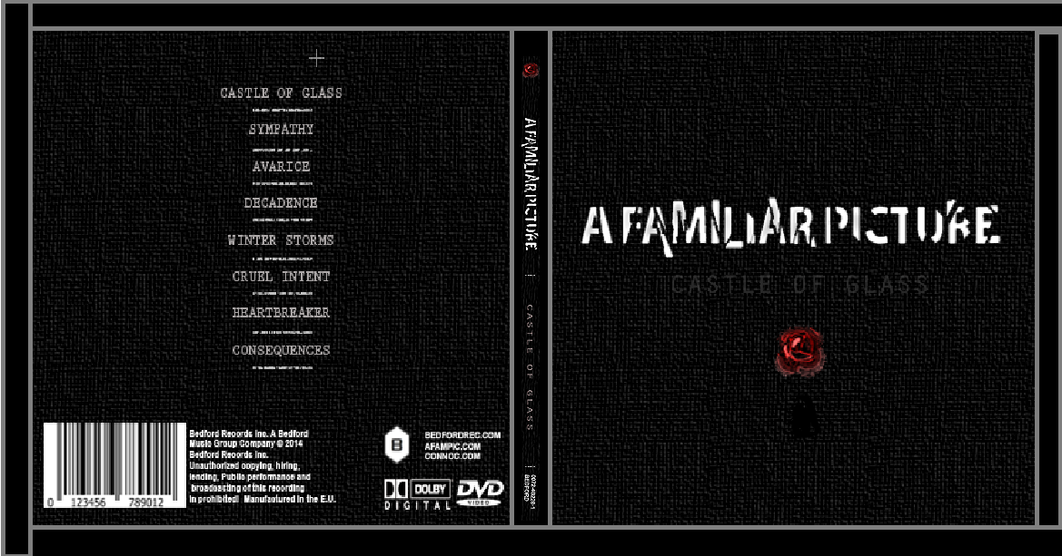
Spine for the CD
Given that CD's Include a Spine of sorts to make them easy to find, it is therefore a requirement in my CD that I create one that is easily linked to the front cover. So here is what I have come up with.
 |
| Incorporated designs from the CD Cover |
As you can see the Spine is very reminiscent of the CD cover which I have already produced, the intention of which is that it give the viewer a familiarity to the CD. The Logo of the rose is present at what will the be top of the CD if it is placed in a row with other CD's on its side, the idea is that the bright red logo on contrast with the black will make it stand out, from there the viewers eyes drift downward to see the band title and name of the album. In keeping it professional the product and licensing code of the CD is present at the end or bottom of the CD as it is in most cases.
As you can see the similarities between the Spine and the front cover make it easily identifiable in a CD rack.
 |
| Incorporated to the CD |
As you can see the similarities between the Spine and the front cover make it easily identifiable in a CD rack.
Subscribe to:
Comments (Atom)