Tuesday, 12 May 2015
Blog Finished
This has been quite an experience for me this year and I hope to see myself doing something akin to this on a professional level in the future. Thank You to all who supported me.
Question 4: How did you use media technologies in the construction and research, planning and evaluation stages?
Media Technology played a crucial role in all the stages of my piece's construction, it has made things so much less hassling to accomplish.
Construction
During the actual construction stages of my Music Video, my Advert and of course my album, the use of technology is excessively prominent, I utilized a multitude of hardware and software to reach my goals for this project and they are wide in range and purpose.
1. Camera - Canon Powershot SX170

All of my video piece was filmed using a Canon Powershot, my previous experience with using similar cameras made it easier for me to figure out how to get the soft sweeping shots of the start of my piece and the camera itself is quite reliable, however, the camera in some ways can be quite grainy, it doesn't lend itself to low lighting and my footage needed to be edited a little to hide these flaws. But other than that the majority of the shots I had with this are clear and clean cut.
2. Adobe Premiere Pro CS6

Adobe Premiere Pro is a very easy to use editing program for video footage and once again I have had prior experience in using this. I've found it incredibly effective in altering my footage to suit the mood of the song with the use of complex filters and the razor tool has given me the capacity to cut my footage down and easily move it around to create strong series of punchy shots that go with the beat. The only issue I ever had with this software was the rendering of my product as I was thrown off by some of the options, but after consulting someone about these issues who had experience this problem was made insignificant.
3. Adobe Photoshop CS6

In the actual text portion of my media pieces including my Album and my Advertisement this program was quite useful. What separate's the program from other editing software is the simplified control layout, my piece was easy to construct as I could test out new elements and apply a series of filters to my piece if I wanted to. My Album is the piece that I believe this has helped me most with, the texturised front of the album is such an interesting design and the smashed weathering on the title could not have been achieved without Photoshop.
Research and Planning
I used a fair number of key technologies in the portion of my piece where it was required I plan out and outline my ideas. Aside from using a number of search engines to find information.
1. SurveyMonkey.Com
Survey Monkey is a self explanatory site which allows users to make surveys for free to pass on to others in order to get their feedback. On a number of occasions I utilized this to ask a number of individuals through the use of a questionnaire if my pieces were following a successful route and if they liked new ideas that I was incorporating, it was a great tool for gauging audience feedback in a streamlined way.
2. Prezi

Prezi is a very interesting presentation software, It is essentially of the same principle as a simple presentation program like Microsoft Powerpoint but it uses animated moving slide and its can allow for much more easier construction and creative freedom than PowerPoint. I have actually been using this throughout my piece and have also been using it to look at others who have created slide on media theory which are much more interesting to view because of embedded content.
Evaluation
The evaluation stage of my piece uses at least more than one form of media technology to illustrate my ideas about the entirety of the piece in an objective sense.
1. Blogger

Blogger is something that has been with me all throughout the piece and not just in the evaluation, the advantages of using blogger is that all of my posts can be easily shaped and edited in addition to being able to use it to present my pieces by either placing the images or embedding the videos respectively. This post itself is of course written on blogger but it has provided me with other advantages as well. Blogger is a large scale website with thousands of users each with their own blog's, a number of these blogs I also visited while planning my pieces as it was full of content ranging from shot types to camera tutorials and old album artwork giving me the knowledge and inspiration to work efficiently.
2. Audacity

One of my evaluation pieces on target audience was made with this program, its a rather simple one in its operation but its one of the reasons I like it, its simple and easy to use and it allows me to record my voice to then convert to MP3 which I then uploaded to a pod-casting site.
3. PodBean

Podbean is the pod-casting site I previously mentioned, what it allows me to do is create web broadcasts which I can then embed into my blogger posts, I have used this before and its easy to use and it can make a post much more interesting.
These are the main technologies I used and in the future im sure that other students will likely be using much more complex programs and items to get their pieces together, We live in an age of technology and im sure that there are many more interesting artistic tools to come.
Evaluation Question 3: What have you learned from your audience feedback?
To answer this question I have produced a short podcast...
http://daveyboy01.podbean.com/e/a2-evaluation-audience-feedback-1430587310/
http://daveyboy01.podbean.com/e/a2-evaluation-audience-feedback-1430587310/
Evaluation Question 1: In what ways does your media product use, develop or challenge forms and conventions of real media products?
Video Piece
In order to answer this question I thought it crucial that I
compare my video piece with the pieces that inspired me to construct the piece
in the first place to address how I have either followed the norms of the genre
or if I have deviated somewhat for one reason or another, Firstly, there are
some key parts in my piece that I believe are grounded in the Alternative Rock
Genre.
The first point where this is visibly prominent is in the
overarching theme of the piece, in my initial research I found that the
concepts addressed in the Alt/Rock genre more often than not touched on more
serious matters, the point that I’m specifically addressing in my piece is the
concept of heartbreak as it can be something that a wide audience can understand
and comprehend.
I also took to mind the concept of splitting the story
approximately 50-50 with a narrative story as a number of music videos in this
genre choose to do including one of my personal favourites, Savin’ Me by
Nickelback, In this case Nickelback has a slightly more in depth narrative than
my piece, the story is much clearer whereas mine is more open to
interpretation. Something I did pick out though which I have touched on in the
past is the use of filters in music videos of this genre, they are always
visible and they are usually used to darker a scene slightly, in some cases the
footage is even slightly grained and I personally thought this could be an
effective addition to my piece, hence the colours being washed out.
The purpose of the colours being washed out this way was
actually to get the theme across better, in my concept the idea was that the
main character is supposed to be somewhat removed from reality as a result of
his implied depression, the bright colouring is supposed to represent how
little he really notices about most of the world and how he drifts from place
to place because of it, which I thought was an interesting design choice and
complimented the narrative well.
The almost linear narrative, with the exception of the
opening with the bridge is yet another prominent feature in this genre, in this
way it allowed me to keep a strong focus on the story as it progressed and it
made it easier to plan out, but at several points I considered starting and
ending the piece with what would be the end of the narrative. I decided to
however stick with something akin to Toderov’s theory of narrative structure in
that my character goes from a disruption of the equilibrium to it being implied
that the equilibrium has been reinstated which is more in line with the style
of my chosen genre.
There are a number of slight deviations from the genre of
course present in this piece, with the exception of one or two videos like ‘How
you remind me’ by Nickelback I found that in the alt rock genre the character
in the narrative isn’t also in the band, in Savin Me it’s a complete stranger
for example. In my piece my main character and the lead singer in the band is
played by the same person, this is due to a difficulty with a limited film crew
and in this case I suppose if I had stuck with the genre I might have been able
to separate the two sections more effectively, in some ways I feel like my
piece would benefit from having more characters to interact with to make it
more interesting.
The use of long smooth opening was inspired by Linkin Park’s
‘Castle of Glass’, the slow smooth opening of the song is accompanied well by
my long moving shot, this isn’t necessarily a staple of the genre, rather one
that I felt for a creative sense would gently lead my audience into the piece
without overwhelming them. The moving shots of my performance piece were
something that I picked up additionally from pieces in the same genre as they
added a strong vibe of energy to the piece.
For the darker parts of my piece it is implied that as an
answer to my main characters problems he turns to drinking, this was originally
going to be addressed much more closely including a scene where bottles would
be smashed although I couldn’t get the desired effect so I simply reverted to
having the bottle present without the violence, in my time looking into the
conventions of the genre the concept of drugs and alcohol, although
occasionally mentioned in the lyrics the music videos for these songs don’t
focus closely on the concept and I make just enough focus on the topic to
divert from the norm in some way, I do believe I could have done the concept with
much more depth a second time round as it could be a really powerful narrative
device.
Album
The album piece that I created is one of the pieces that I’m
most proud of out of everything I have constructed, after completing it the
feedback I got from my peers on it was very positive and it was frequently
mentioned to have been of a professional standard. Of course this question is
based on where I challenged the convention and where I stuck to it so let’s
begin.
Firstly, the idea to have the stylised band logo came as a
mixture from 3 key sources, I took a great deal of inspiration from 3 existing
bands who use the same logos across all
of their pieces, they also had their logos stylised to reflect the theme of the
band. For example, the first of the three was the logo for Linkin Park, which
has always shown a sharp and jagged logo which has always indicated to me the
bands sharp beats and heavy rock tones quite well, in addition to this the
weathered effect found on the logo for the band Nickelback also appealed to me
as it indicated that the band touch on sad or depressing tones which a lot of
their early work did, finally I brought all of these ideas together with the idea
of using completely non–standard font design similar to that of the band good
charlotte who’s font is punchy and non-conventional in a way. Together this
pushed me to creating the jagged and weather glass font that I’m quite
considerably pleased with, the glass itself is also designed to reflect the
theme of the song ‘Castle of Glass’ which is used in my music video, therefore
promoting synergy in some ways between the two pieces. It is in this way that I
suppose I followed the general conventions of the genre because they would
advance my own product effectiveness as a result by giving it an aesthetic
appeal that would help attract the audience and assist in the likelihood of the
purchase.
The customised images inside the album itself was a creative
choice that was inspired by the album ‘Living Things’ by Linkin Park, inside
the album there was an incredibly beautiful design that ran along the entire of
the piece, it was incredibly aesthetically pleasing and it inspired me to
include a strong illustration in the lyrics pages of my album. When I sat down
to plan out some ideas for the piece I realised that while a lot the bands in
the genre generally kept the same style of design throughout the piece, I could
potentially do something else that I thought was a clever way of more closely
connecting the actual music to the design. The custom logos are designed to be
both aesthetically pleasing but to also tell the individual what the theme of
the song is which should give a small clue as to how the music sounds, for
example, the song ‘Consequences’ on the album has a military style logo, which
should indicate that the concepts of war and death should come into play.
The sharp contrast of Black, White and Red was a personal
choice that was partially inspired by the frequented style chosen by many bands
in me genre, when I was planning my piece I saw that the bands tended to keep
the colours from merging, they were always in a sharp contrast to each other to
make them stand out on the shelves of a music shop, taking this one step
further I centralised the most prominent colour and really made it eye
catching.
Advert
My advert is an interesting piece because I changed it
entirely at the last moment, after finishing my original advert I wasn’t fond
of it at all. I felt that the style of the glass was too uniform in addition to
the text looking dull and boring. As a result at the last minute I switched my
advert for something that I had been working on in the side-lines of my piece.
A poster I was making for my piece simply to test out Photoshop and
compositions for my piece actually ended up being used for my advert. In
actuality feedback that I got from a number of people suggested that the poster
actually both looked professional but also provided much more information than
the advert, or at least it seemed too.
The actual design aspect of my piece is something that is
almost entirely set apart from the usual conventions of my genre aside from the
colour choices. I found that in a lot of magazine adverts from alt-rock bands,
it was generally the band members being put together on the page. My advert doesn’t
feature this but I decided against this for some key reasons. Since this is my band’s
debut album it doesn’t seem necessary to include a picture of the band since it
will do little to make the audience remember them since they aren’t an already
established staple of the genre. The lack of the band also gives more
opportunity to stick to shapes and thin blocks for design which can be great
for contrast as it gives a larger surface area of the same colour to be more
visible to the viewer.
Conclusion
Essentially my piece doesn't challenge the genre in an exhaustive sense, but what it does do is slightly tweaks some of the more prominent stereotypical aspects, a colour filter as visible as the one I used for example wouldn't neccesarilly commonly appear as its more from another genre. The video maintains most of the conventions of the original genre in general in order to still seem familiar to the target audience who have witnessed the genre in action before but the personal spins are designed to promote synergy or to give the piece a slight artistic sense. As one viewer of the video informed me, the piece is Alt-Rock at its core but a small amount, just a very small styling of an indie video occasionally shines through similar in some ways to a hybrid.
Essentially my piece doesn't challenge the genre in an exhaustive sense, but what it does do is slightly tweaks some of the more prominent stereotypical aspects, a colour filter as visible as the one I used for example wouldn't neccesarilly commonly appear as its more from another genre. The video maintains most of the conventions of the original genre in general in order to still seem familiar to the target audience who have witnessed the genre in action before but the personal spins are designed to promote synergy or to give the piece a slight artistic sense. As one viewer of the video informed me, the piece is Alt-Rock at its core but a small amount, just a very small styling of an indie video occasionally shines through similar in some ways to a hybrid.
Saturday, 2 May 2015
Presentation
Below is the Presentation I gave on my A2 Pieces It covers a number of different topics surrounding the construction of my pieces...
[For the purposes of grading this space will have the video, just having some upload troubles but itll be here]
...As previously mentioned I decided to switch my advert with my poster because of the suggestion made in this video. I am grateful for the feedback.
[For the purposes of grading this space will have the video, just having some upload troubles but itll be here]
...As previously mentioned I decided to switch my advert with my poster because of the suggestion made in this video. I am grateful for the feedback.
Wednesday, 22 April 2015
Evaluation Presentation
I have just completed my evaluation presentation where I talked about some of the themes and ideas I had when making my piece. It will be uploaded within the week.
A2 Final Advert
This post is just to clarify what I said previously, my new advert is essentially my poster. While it may be seen as them being completely different in the idea, mine can be interchangeable as I will explain below...

While some may say that it would be difficult for me to interchange the two when I had different ideas between the two based on the general differences between an advert and a poster, my piece has the advantage that doesn't make this such a difficult switch. For example, a strong advert should inform the audience where possible of the name of the album, where to get it and to provide an opinion from a respected official, Luckily this achieves these goals and is much better in terms of composition and content than my original advert.
What this does especially well from everything else is promote synergy, which is key in marketing and raising awareness of the CD and the Band. The fractured glass is much more refined and punchy when it isn't symmetrical like it is in the other one, the theme of glass and the dark undertones illustrate clearly the bands style and the style of the music on this album.
The small 'Button' style informational boxes for the 'Google Play Store' and 'iTunes' also tell the audience where to purchase the album making the piece convenient and short, there isn't "too much" clutter on the page like the previous one had and everything has a nice spacing around it making it much easier to read and focus on. The Kerrang! quote is handy in giving the audience an opinion from a respected rock magazine, it should in this way pique their interests and intrigue them, especially given that Kerrang! and MOJO are the top selling Music magazines on the market.
With the addition of the bands website this all come together spectacularly and so this makes a much more effective advertisement than my previous submission.
A strong suggestion during my presentation
My evaluation presentation which will be uploaded soon was a good outlet for me to express what I felt about my piece, however, one of the key things suggested to me was that I exchange the existing advert for my poster. This is an idea that somehow slipped my mind, but i'm glad it was suggested because I have a particular love of my poster compared to my advert which I believe doesn't express the tone well enough
 |
| To clarify, I will be exchanging this... |
|
| ...For this! |
Monday, 13 April 2015
Intentions for the Evaluation
The Evaluation for my A2 Media Course will require me to answer 4 Key questions covering 4 Key Areas:
1: In what ways does your media product
use, develop or challenge forms and conventions of real media products?
2: How effective is the combination of your main product and ancillary texts?
3: What have you learned from your audience
feedback?
4: How did you use media technologies in the
construction and research, planning and evaluation stages?
- I will discuss how I used these comments to edit my pieces to better understand my target audience.
Thursday, 19 March 2015
Wednesday, 18 March 2015
Video Editing Journal - 2: Warp Stabilizer and Luma Keyed
I have implemented the Luma Key tool in a number of the introductory shots which should help set the tone better to a significant degree.
 |
| Luma Key Tool in place gives a sinister dim tone to the piece which is more of what I wanted |
In addition to this I have implemented the Warp Stabilizer tool to a fair portion of my Footage which I believe helps to smooth out the shots and make it look more legitimate. I have put together this short demonstration.
Spine for the CD
Given that CD's Include a Spine of sorts to make them easy to find, it is therefore a requirement in my CD that I create one that is easily linked to the front cover. So here is what I have come up with.
 |
| Incorporated designs from the CD Cover |
As you can see the Spine is very reminiscent of the CD cover which I have already produced, the intention of which is that it give the viewer a familiarity to the CD. The Logo of the rose is present at what will the be top of the CD if it is placed in a row with other CD's on its side, the idea is that the bright red logo on contrast with the black will make it stand out, from there the viewers eyes drift downward to see the band title and name of the album. In keeping it professional the product and licensing code of the CD is present at the end or bottom of the CD as it is in most cases.
As you can see the similarities between the Spine and the front cover make it easily identifiable in a CD rack.
 |
| Incorporated to the CD |
As you can see the similarities between the Spine and the front cover make it easily identifiable in a CD rack.
Monday, 16 March 2015
Album Booklet Pages
These are the pages to the booklet that I have been working on, they will be housed together as a single piece in the left side of the album when it opened.
Pages 1 and 2: Legal Information and Illustration

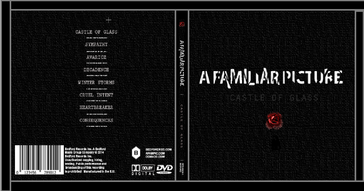
Pages 1 and 2 are the introductory pages in the booklet, the first page contains a simple track listing with the timing of each track. The Legal information at the bottom also reinforces the legitimacy of the piece to some extent, the Illustration on the second page serves the purpose of keeping with the theme of the album i.e 'glass'.
Pages 3 and 4: First Lyrics Pages

Pages 3 and 4 contain the lyrics to Castle of Glass and Sympathy , Listed as Tracks 1 and 2. They seem to fit together well enough and there spacing is based on templates of actual size.
Pages 5 and 6: Second Lyrics Pages

Pages 5 and 6 contain the Lyrics to Avarice and Decadence, Listed as Tracks 3 and 4.
Pages 7 and 8: Third Lyrics Pages

Pages 7 and 8 contain the lyrics to Winter Storms and Cruel Intent, listed as Tracks 5 and 6.
Pages 9 and 10: Fourth Lyrics Pages

Pages 9 and 10 contain the lyrics to Heartbreaker and Consequences listed as Tracks 7 and 8.
Page 11: The Back of The Booklet

From what I have seen from looking at various booklets from bands of this genre, the piece's range from using one large image on the back of the booklet or a repeat of the back of the CD. I have opted for the contents as it doesn't break the conventions of the genre and its highly convenient.
In conclusion this will be my inserted booklet, Which covers the CD portion of my work, Overall I think it flows well enough and is sufficiently reminiscent of Cd's in the Genre.
Page 11: The Back of The Booklet
From what I have seen from looking at various booklets from bands of this genre, the piece's range from using one large image on the back of the booklet or a repeat of the back of the CD. I have opted for the contents as it doesn't break the conventions of the genre and its highly convenient.
In conclusion this will be my inserted booklet, Which covers the CD portion of my work, Overall I think it flows well enough and is sufficiently reminiscent of Cd's in the Genre.
Monday, 9 March 2015
Digipack CD Dimensions
The Dimensions that the Digipack will follow can be indicated with the following template

The General Width of a CD is about 5 Inches with a height of about 5.6 Inches due to the extended spine. I can add my CD Design here to illustrate what It would look like.

As for the Booklet, It would be found inside the left side of the Album, the as with most CD's the Front would slide out and would be readable while the back of the CD Remained settled in its own space behind the CD Housing.
Friday, 6 March 2015
Video Editing Journal - 1
I have pieced together the first 2 Minutes of my final piece, so far and I believe it to be coming along well, The general theme of the piece that I had in mind when I created it has been preserved. The Section that has been put together is basically the introduction to the piece and features a moving section through the woods to go with the fairly long lead in that my chosen song has.
 |
Standard Slow Moving Shot
|
However, since the beginning of my piece is intended to be the section of the story where the main character is depressed or in a grim/negative mood I think that the bright coloring of the forest, especially the prominent greenery needs to be toned down, I think that by using the Luma Key tool this can be achieved easily.
Digipack Lyric Pages
In an earlier post I mentioned that I was incredibly fond of the Linkin Park lyric pages from the album 'Living Things' because it featured an incredibly illustration which accompanied the text and generally made the piece appear much more pleasant. I wanted to incorporate imagery into my piece somehow so I used images that match the theme of the song, I'm finding it to be quite interesting, some of these will of course be tweaked slightly and I will point out any possible changes I really feel I want to make as I go.

The first page of the Lyric sheets is 'Castle of Glass', I used a vector of broken glass as it seemed appropriate, the original vector required its color inverting but I think this is a nice effect in general. The shades aren't too striking but I think that they make enough of an impression to give the page a bit more of a punchy character and they alleviate the boredom of their being simply text.

The Second Page of the Lyrics is for the song 'Sympathy'. I'm still not 100% sure on the design for this one, I'm not absolutely settle on the pencil shading, as well as how bright the colors are given the topic, a feasible solution would be to replace the color red with a darker shade as well as the green stem, I may not change this but currently I think this may be better suited to the topic if the color was darker.

The Third Page is for the song 'Winter Storms', I'm quite fond of the simplicity of this one and the only thing id really like to change is how bright the white lighting is, I'm not sure if I want the image to overpower the text like this, I also think that the branches are too sharp and clear, I would like the edges to be a little rougher to accompany the 'storm' concept of the song.

While I originally had difficulty with this page because of what I thought the word 'Avarice' could be connoted with, eventually after a brief talk with another individual, I decided that a blood diamond would be appropriate given how they are sought after due to their substantial wealth, yet the acquirement of one ends up in death. I enjoy seeing the strong sharp lines on the edges of the diamond as it makes each section stand out.

In its current state i'm not entirely fond of this design, to me it just appears to be too bland compared with the other images, the issue is what exactly can be used to connote cruel intent as it is rather specific.
I will post on this again when changes and tweaks are made.
Thursday, 5 March 2015
Filming and Editing
I have finished the bulk of my filming at this point, what follows now is a strong focus on editing, the main issues I will be tackling while doing this will be getting the tone and the colouring how I want it to be, as raw footage it doesn't match the tone. Id like to make it more connected to the theme and the mood that I want to express to the audience.
Sunday, 22 February 2015
Band Poster
I feel like this is the design choice that I am going to use for my band poster, I believe that it sufficiently connects the three print products together and is easily visually connected.
 |
| The Band Poster |
I believe that this can immediately be recognisable in connection to the Advert and the CD because of a number of things. Firstly, the band logo is present with minimal change, the signature red rose is also present just as it is on the other two products which is helpful here as well giving its aesthetically pleasing look and powerful contrast which I also used to my advantage in my advertisement as it draws the eye with its bright tones.
The theme of glass has once again been preserved, as you can see the sharp broken edges at the top give the poster a shattered and sharp look which is spread through out the entire piece, forcing the audiences vision onto the only clear section, which is where the important content of the piece lies.
As for the review placed at the bottom, my research had found that among the most prominent Rock and Alternative Rock based magazines, some of the most popular of all were 'MOJO' and 'Kerrang!'. 'Kerrang!' however actually still maintains its stature as having the most sales of any other rock magazine currently available and as such it warrants a great deal of respect from them by fans of the genre. I felt it fitting to use a review from them as it would give the album a sense of professionalism as it would indicate that the songs on the album were of an incredibly high quality. On a side note, I also used the magazines logo title in place of text, simply to give audience members who were aware of the magazine, yet who couldn't fully remember the name. the inside information required.
The two vectors in the bottom corners are for the audience to be made aware of where this album can be purchased in case the poster peaks their interests and gives them the interest in buying the album. The bands website is also present to give the audience a constant reminder of where to find out about tour dates and CD information they cant find elsewhere.
Friday, 20 February 2015
Band Poster Ideas
As I mentioned in my pitch I was going to include a poster which would be available for purchase in my piece, the production of this piece will need to keep a few things in mind. Firstly, in keeping connected to the other two print products the poster will need to keep a similar theme, the bands name logo must be the same and I would expect there to be a similar illustration as the one found on the CD.
However, the poster must of course be treated differently to the advertisement in the magazine. The poster should instead aim to be more aesthetically pleasing and should focus on making the album seem appealing, as for the information it should provide it should make mention of its availability through the means of the modern 'Google Play' or 'Itunes' vectors in addition to the bands website.
However, the poster must of course be treated differently to the advertisement in the magazine. The poster should instead aim to be more aesthetically pleasing and should focus on making the album seem appealing, as for the information it should provide it should make mention of its availability through the means of the modern 'Google Play' or 'Itunes' vectors in addition to the bands website.
Wednesday, 18 February 2015
Magazine Advertisement From Plan
I have been working on my magazine advertisement and I believe that I have gotten it to a standard that I am happy with, I used the plan to construct it and I will explain my feelings towards it below:

This is essentially going to be the Magazine Advertisement for my piece. I generally feel like the bordering on this piece is one of the more interesting features, they provide both a connection to the CD and the theme, but they also serve in centering the contents of the piece, In a sense they are surprising imposing but they create a strong uniformity in their presence.
The band logo is of course present as it should be in addition to the style of the band name. These two together promote the synergy i was looking for between the CD and the Advert.
 |
| The similarities are quite visible in my opinion. |
The use of custom fonts is also something that I enjoy about this piece, the lettering all comes together to promote the themes of the album and their brightness on the page makes them incredibly legible.
These are essentially the concepts that I feel proud of in this piece and I believe its a positive step to promoting the band.
Friday, 13 February 2015
Magazine Plan Based on Research
From what I have seen I can construct a basic plan to follow for my magazine, I will explain it in detail from the illustration below:

Essentially this will be the basis for my design, it will help me keep it the way it should be in connection to the genre and conventions of professional pieces.
MAIN BAND TITLE
The Main band title has been placed at the most visible point, given that we read top to bottom it is likely that this is one of the first things to be seen. because the band is only just starting up it is crucial that its name be advertised highly and in addition to this is is more likely that people will be able to recognise a band name before a album name.
The title will be the band logo that is present on my CD, the purpose of this is to keep the two items in connection so that when an individual actually goes to buy the album he/she will be able to immediately recognise it from the advert creating a synergy between the two.
SEPARATOR
I have added a separator between the sections of my piece, simply put, its designed to stop information overload and make the whole piece easier to read, the separator gives breathing room the piece and will most likely be of a broken glass styling in connection to the album to promote synergy.
NAME OF THE ALBUM
The name of the album will be placed here in what is relatively near the centre of the piece and will be easy to read and see, I will probably once again apply a fractured glass effect here but i will make sure that it is still clear and legible as it is one of the more important things to remember when purchasing the CD.
LARGE ILLUSTRATION
The large illustration mentioned on the plan will serve a purpose of creating a bright red contrast. This is something I picked up from 30 Seconds to Mars' advertisement for 'This Is War' which I researched earlier, it featured a contrast between white, black and red which was artistic, bold and very effective. By having this bright colour sit among the darker shades it makes it stand out, when a person is reading through the magazine they will undoubtedly have their attention caught by it and will be more likely to read the page fully as a result.
EXPLANATION OF THE DEBUT ALBUM
As this will be the bands debut album, they will probably not be as well known essentially. the explanation tends to stop confusion as to if individuals are familiar with the band, it also peaks the interest of people looking for new interesting music in the industry.
MENTIONING OF TRACKS
The purpose of this being here is for two main reasons, Firstly by having the track titles listed it gives the audience more of an indication of the themes that will be present in the songs, from this they will be likely to determine whether or not it suits their interests. in another sense it is also relevant for existing fans of the band prior to the first album who want to know if the songs that they enjoy are present, keeping the audience informed and minimizing distaste with the purchase.
CD AVAILABILITY
This is simply here to explain whether or not the CD is currently available, Saving people having to look it up.
WEBSITE AND RECORD LOGO INFO
This is here to give people easy access to the bands website to fully inform the audience on the bands tours, available merchandise and albums. The record logo is also present for legal purposes.
SHATTERED EFFECT
The shattered effect i have mentioned at the top will be there to provide and aesthetic connection to the theme of the album, I.e. Glass. It will also help to make the page more interesting and professional in appearance keeping the interest of the reader.
Thursday, 12 February 2015
Change in the beginning of my piece

Shooting In Low Light Conditions
I have had some great difficulty in shooting a certain section of my piece which takes place at night. In earlier posts I mentioned that my piece includes a particular scene wherin the main character takes a photograph and throws it onto the fire in a mix of POV and mid range side shots. The effect I was going for would be to have the fire illuminate him in an orange glow.
The difficulty this has actually posed to me is that the camera I am using, like many cameras of its kind, suffer in low light conditions and produce a fair amount of visual noise which is not the effect I would like, By researching this issue I have looked into how to better shoot in low light conditions and these are some options for fixing this suggested to me :
- "Shooting brighter and bringing down in post should reduce noise and is a viable option" - Michael Markham
- "What you can try, is lighting the actor from the side with a strong light and from the other side with another light to even out the face"- Samuel Zerbato
"- Lighting darkness on DSLRs is very hard. Many of them don't perform very well in low-light scenarios. One thing to do is to try to use colder lights and dim them down slightly" - Shaia Erlbaum
 |
| Many different cameras have this issue and the visual grain and noise is visible |
The difficulty this has actually posed to me is that the camera I am using, like many cameras of its kind, suffer in low light conditions and produce a fair amount of visual noise which is not the effect I would like, By researching this issue I have looked into how to better shoot in low light conditions and these are some options for fixing this suggested to me :
- "Shooting brighter and bringing down in post should reduce noise and is a viable option" - Michael Markham
- "What you can try, is lighting the actor from the side with a strong light and from the other side with another light to even out the face"- Samuel Zerbato
"- Lighting darkness on DSLRs is very hard. Many of them don't perform very well in low-light scenarios. One thing to do is to try to use colder lights and dim them down slightly" - Shaia Erlbaum
Magazine Advertisement for Piece
For the Magazine advertisement portion of my piece, I am going to need to find and recreate codes and conventions of existing Alt-Rock/Rock pieces to try to make the piece easily identifiable as the genre and to also ensure that a level of professional quality is achieved, here are some prime examples that I have picked out from a couple of different bands in this genre.
Linkin Park - A Thousand Suns

For this advertisement I am particularly fond of the digital fractured look of the piece, it gives it a very sinister and powerful appearance which is something that is made more powerful by the dark tones (simple black and white). The information given is questionable, there is limited information available about the actual album apart from a website address at the bottom of the piece, I feel more comfortable placing a mention that my piece is an album to clarify what its for but I still enjoy the design of this piece. The use of the band members in the actual advertisement is something I don't intend on pursuing, because my band is a new up and running contender in the music world, the relevance of having a band whose members are scarcely recognizable placed in an advertisement would be a waste of space I could fill with powerful imagery such as symbols and a continuation of the fractured glass look with either and object like a rose. What I think I will take from this design is the spacing in each section for a start, it makes each part easily readable, I'm quite fond of a fractured design style and It works well given my album design.
Kasabian - The Debut Album

30 Seconds to Mars - This is War

Immediately I notice that this piece is the most striking of the three, the bright reds compliment the Black and the white sections of the piece in an incredibly powerful way. The effect of which both makes it clear to read but it also stands out on the page, when turning through the magazine the powerful contrast between the colors would warrant a brief pause in which to view the piece. The sharp lettering and square background give the whole piece a professional and uniform look that gives it a strong and smart outlook, I am incredibly fond of the concept of utilizing these contrasted color effects in my piece as they are key to catching the readers eye in my opinion.
Overall between these three pieces I can see some strong ideas emerging, the inclusion of all the relevant information is key and this is closely followed by the contrasted coloring, the effect of these two being combined is that it should catch the readers attention and then inform them clearly on what they are looking at. I feel that I should also include some fractured effect for the wording as it would make the connection between my album and this advertisement so that once the album took its place on the store shelf, it would be recognizable to the advert and easily obtainable.
Wednesday, 11 February 2015
Front and Back of Album
I have finished the design work on the front and back of the album for my piece, I am quite pleased with the results as I believe they look quite professional and convey the mood of the songs on the album:


Subscribe to:
Comments (Atom)